In this episode we’ll learn how to build Modal Dialogs for UXP plugins. Feel free to watch the video or read the article, they cover the same ground.
ExtendScript history
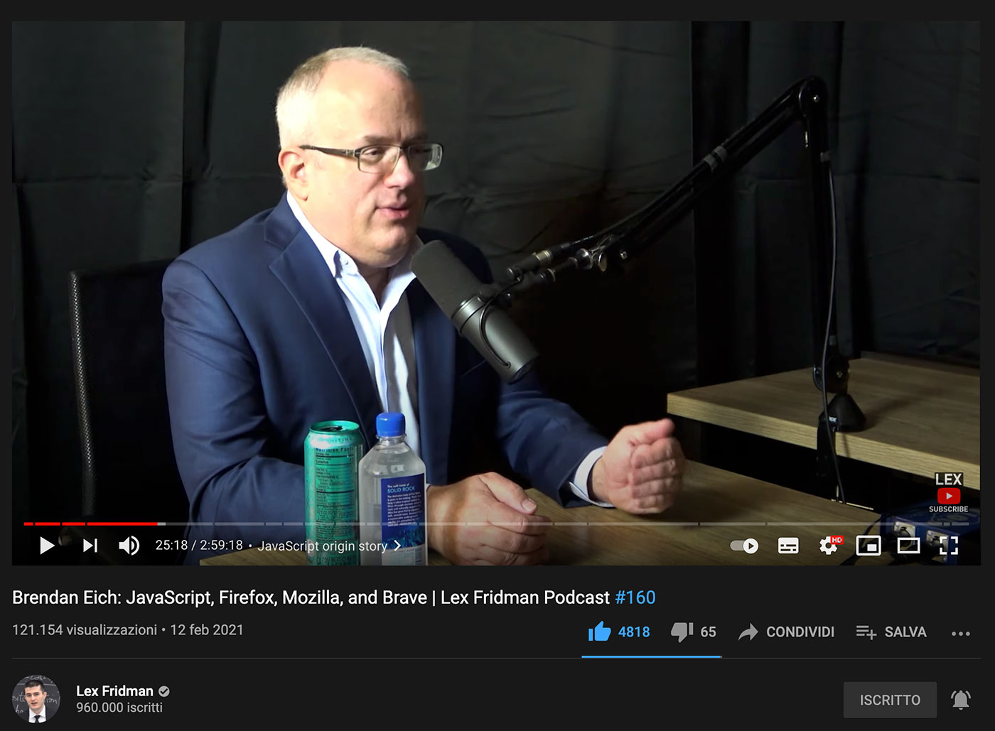
ExtendScript was the language that we’ve been using to script Adobe applications literally forever. It was based on the ECMAScript spec version 3 (a.k.a. ES3), that was cutting edge in the decade 1999-2009. Trivia moment: ECMA stands for European Computer Manufacturers Association, and it’s the organization that standardized the JavaScript language under the name ECMAScript. There’s a terrific interview with Brendan Eich (who famously created JavaScript in a hurry in just 10 days) in Lex Fridman’s channel, check that out – trust me, the man is quite something.
So in a way JavaScript and ExtendScript share a “common ancestor”, ES3, but their evolution diverged. Adobe extended (hence the name) the ES3 spec with extra features e.g. the E4X library for XML literals support; while JavaScript went on with ES5 (JSON support, Array methods…), ES6 (new syntax…), etc.
Fast forward to the Adobe MAX 2020 conference and the adoption of a new, unified UI/Scripting engine in UXP. All the ExtendScript extras that we were familiar with are now gone: disappeared, no more. This is the price we’ve got to pay to have a modern JavaScript engine – fair enough. Some fellow developers might not have realized this because there was a lot to sink in, but probably the most conspicuous feature that’s gone missing is the entire ScriptUI class, that has always been the principal tool to build script-driven Windows both in the CEP era and also way before when the Cloud was not around and all we had was a Creative Suite.
Let’s be clear about terminology before going any further, so that no matter what your background is we’re all on the same page:
- Dialog: an independent window that pops up and can be:
- Modal: it steals the focus, you can’t interact with any other UI element but the dialog itself.
- Modeless: the dialog stays around and you’re allowed to deal with the rest of the Photoshop interface.
The concept of Modal vs. Modeless UIs is present all over in the Photoshop interface, e.g. Adjustments: on the left a Modal dialog, on the right a Modeless panel.
We used to build modals with ScriptUI Windows of type 'dialog', and in theory modeless with ScriptUI Windows of type 'palette', but those weren’t really supported in Photoshop – they acted weird and we’ve been officially advised against their use. Before CEP came about, ScriptUI was enough to build rich UIs:
But as soon as Flash first, then CEP panels landed in Photoshop, ScriptUI was relegated to simpler dialogs or for backward compatibility only. You may not know it, but also those super-handy alert(), prompt() and confirm() dialogs were part of ScriptUI.
// Old ExtendScript code
var res = prompt("What's the meaning of life?\n" +
"Feel free to think as long as you need to...", 42);
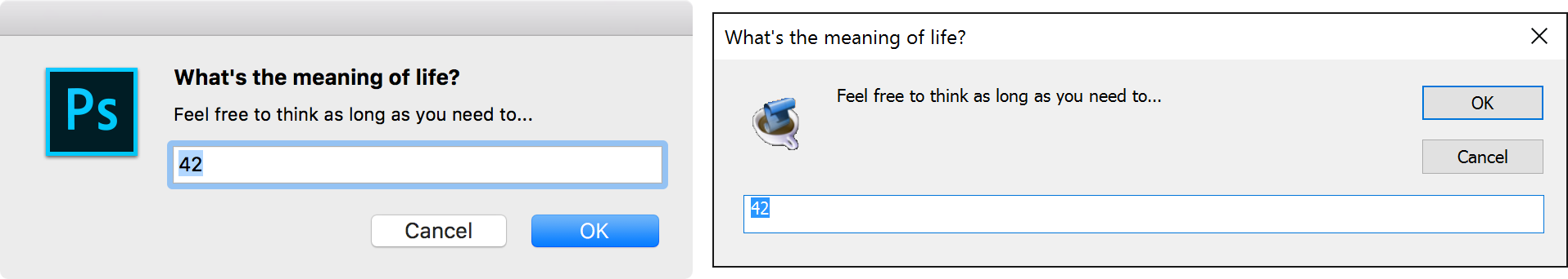
They’re all gone too, with the exception of alert() that’s been re-implemented in the Photoshop API as showAlert().
// Photoshop API
const photoshop = require("photoshop")
await photoshop.app.showAlert("Get ready!\nRight on");
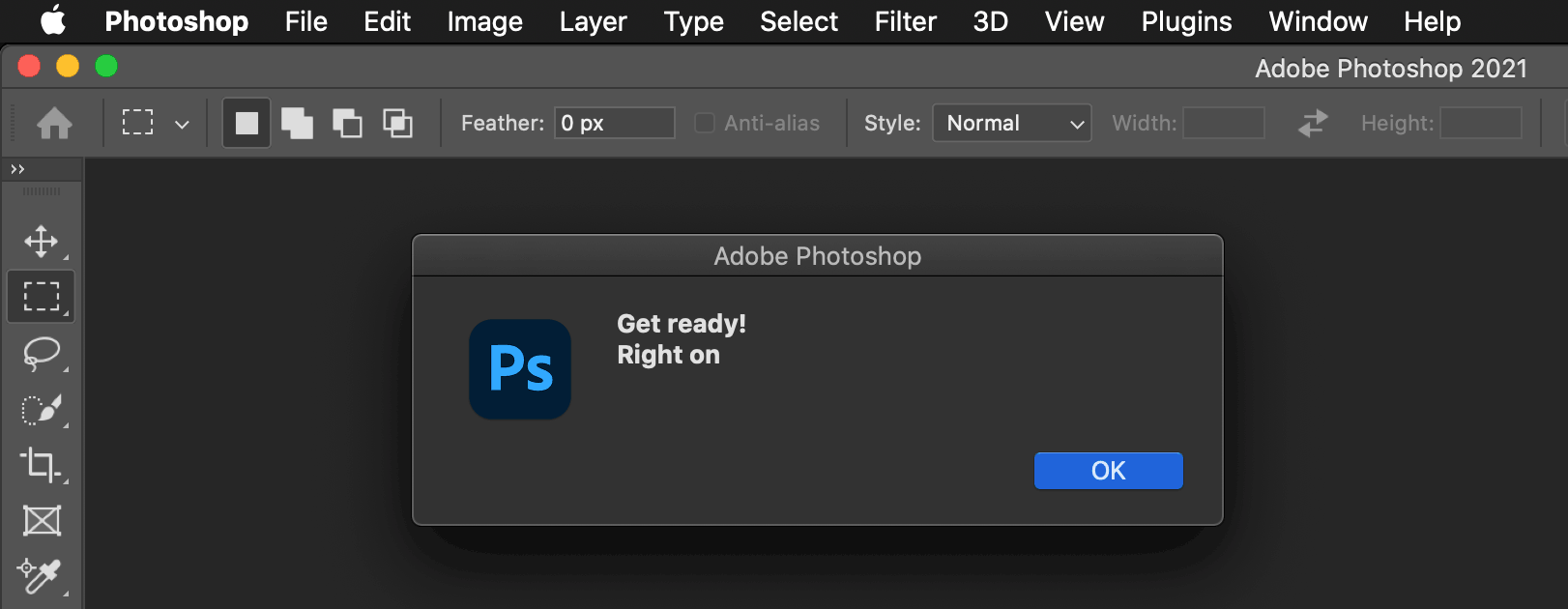
Even though it doesn’t differentiate between title vs. text yet (they’re both bold, only the title should be) – a minor cosmetic glitch.
Anyway, whatever code we used to write in the recent past to create dialogs, that’s gone now – thanks for all the fish. UXP provides alternatives for both modeless windows (as UXP panels, that I’ve extensively covered) and modal dialogs, which I’m going to show you in a moment.
⚠️ Disclaimer
UXP is a technology under very active development, so the code that I’m showing you may be subject to change in the future: this is the premise of all my work here, given nature of the topic – rest assured that I’ll post updates if/when needed.
That said, there are features that might be already available for you to use, but not really (either partially or fully) documented yet. Incidentally this happens to be the case of some Dialogs, so I was dubious whether to include them here or not. I’ve decided that I will mention them anyway because IMHO it’s crucial for you to plan ahead and be informed about the actual realm of possibilities, so to speak. Although I would suggest not to use those features yet, for the risk that the API will change is even greater – be warned.
As a general rule, you won’t hear a word from me about anything that belongs to the prerelease, or that works in beta versions only – besides breaking all sort of NDAs, it would be pointless. Instead, if the feature is implemented in Photoshop-release I might mention/show it, essentially to inform you but deferring for the actual use to some time in the future when the official documentation covers it fully.
I’ve prepared two different UXP plugins to show you a few of the possible ways to use Dialogs – one using vanilla JS and the other based on React.js. I haven’t covered React here yet, but it felt wrong to leave that out. You can find both of the examples in my GitHub repository.
Vanilla JS UXP dialogs
This vanilla JS example comes directly from the ps-starter template that is available from the UXP Developer Tool (see here if you still need pointers).
The base structure is very bare, just some Spectrum UXP components:
<sp-heading>Dialog examples</sp-heading>
<sp-divider size="large" style="margin-bottom:10px"></sp-divider>
<sp-body>
  Two different ways to create modal dialogs.<br />
  Please note that Spectrum Dialogs API is still a work in progress.
</sp-body>

<div class="row" style="margin: 20px; justify-content: space-around;">
  <sp-button onclick="openDialog()">dialog</sp-button>
  <sp-button onclick="openSpectrumDialog()">sp-dialog</sp-button>
</div>

<!-- Version Info, to be filled by JS -->
<sp-detail size="L" id="info"></sp-detail>
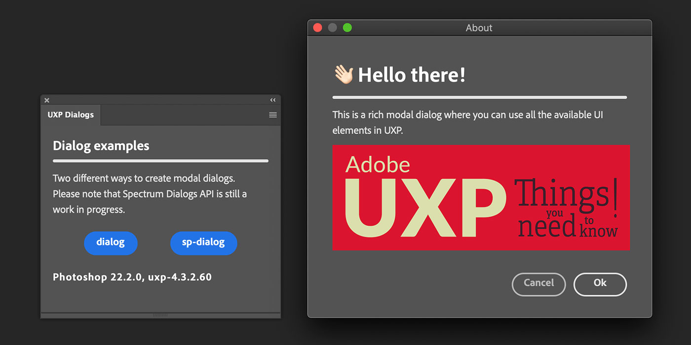
Let’s cover what is officially documented first, which is the result of the first “dialog” button. In order to create a modal dialog, you need to have an actual <dialog> element in the <body> first:
<!-- Standard Dialog -->
<dialog id="dialog">
  <sp-heading size="L" style="margin: 0">👋🏻 Hello there!</sp-heading>
  <sp-divider size="large" style="margin:10px 0"></sp-divider>
  <sp-body>This is a rich modal dialog where you can use all
  the available UI elements in UXP.</sp-body>
  <img src="img/UXP.png" width="400">
  <div class="row" style="justify-content: flex-end; margin-top:30px">
    <sp-button variant="secondary"
               style="margin-right:10px"
               onclick="document.querySelector('#dialog').close('NOPE')">
      Cancel
    </sp-button>
    <sp-button variant="primary"
               onclick="document.querySelector('#dialog').close('OK')">
      Ok
    </sp-button>
    <!-- ESC will return "reasonCanceled" -->
  </div>
</dialog>
The <dialog> element itself is nothing special, I’ve used Spectrum elements that we’ve seen in the past episode like <sp-heading>, <sp-divider> and <sp-body>. Please note that, as I’ve also mentioned in the Spectrum episode, a class of "row" or "column" triggers the display equals to flex in the <div> so it’s possible to use FlexBox-specific styles such as justify-content etc.
The two <sp-button> elements onclick handlers both use the close() method of the dialog, that in turn is retrieved with document.querySelector() passing the id, which is in fact "dialog" (I hope this is not confusing).
Please note that even if the markup code is there, the dialog doesn’t pop up by default. In order to open it let’s have a look at the openDialog() function that is triggered by the plugin’s “dialog” button.
const openDialog = async () => {
  const res = await document.querySelector("#dialog").uxpShowModal({
    title: "About",
    resize: "both",
    size: {
      width: 464,
      height: 380
    }
  })
  console.log(`The dialog closed with: ${res}`)
}
So, the dialog is retrieved with the same querySelector() but to open it we run the UXP-specific uxpShowModal() method. That accepts an options object with a title property (the dialog’s title bar); a resize prop, that controls whether the dialog is resizeable (either "horizontal", "vertical", "both" or "none" – might still be a bit buggy, it was in the past); and size, an object with width and height properties (quite self explanatory).
To sum up: you add to the <body> one or more <dialog> elements (that you can get by id) filled with whatever elements you need. You open the modal dialog with uxpShowModal() passing an options object, and you can close the dialog with the close() method optionally passing a return value (in the example I’ve got close('NOPE') and close('OK')). Also note that opening a dialog is an asynchronous process (hence openDialog is an async callback, and it awaits for the uxpShowModal()) that allows the result res to be stored/logged afterwards. If the user cancels, a "reasonCanceled" string is returned.
Spectrum dialog
Warning: this is, as I said earlier, still undocumented so please wait for the official documentation and/or use with caution.
Instead of a <dialog> element, there’s the possibility to use a <sp-dialog> that allows some pre-defined styling as slots. You still place it in the <body> markup:
<sp-dialog id="sp-dialog">
  <sp-heading slot="title" style="margin: 0">Use with caution!</sp-heading>
  <sp-icon slot="icon" style="color: #ec5b62" size="m" name="ui:AlertSmall"></sp-icon>
  <sp-body slot="description">
    Spectrum Dialogs are still undocumented, yet available in PS-release.
    <br />
    Be aware that this possibility exists and keep an eye on the Doc.
  </sp-body>
  <sp-button-group slot="buttongroup">
  <sp-button variant="primary"
    onclick="document.querySelector('#sp-dialog').removeAttribute('open')">
    Ok
  </sp-button>
  </sp-button-group>
</sp-dialog>
But the result is strikingly different:
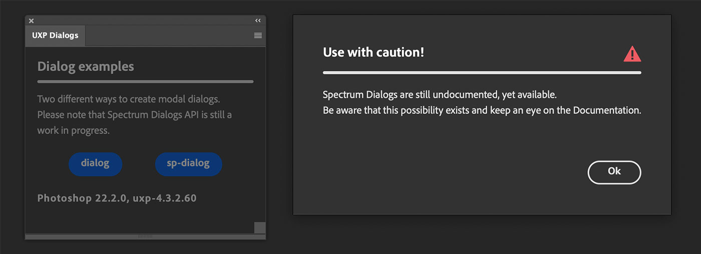
The modal dialog is blocked in the screen’s center (you can’t move it) and the panel gets darkened. There are several slots such as "title", "icon", "description" and "buttongroup". I won’t go too much into any of those because, as I’ve mentioned, it’s better for us to wait for the official documentation. One major difference is that you don’t use uxpShowModal() anymore:
const openSpectrumDialog = () => {
  document.querySelector("#sp-dialog").setAttribute("open");
}
Instead you set the "open" attribute of the <sp-dialog> element. Similarly, as you can see in the dialog “Ok” button’s click handler, to close the dialog you just remove "open" via removeAttribute().
Now you know that this is possible and it’ll be soon documented – you can play with it in Photoshop 22.2. Speaking of versions, if you’re wondering how the Photoshop/UXP line fills:
// fills the versions sp-detail
const uxp = require("uxp");
document.getElementById("info").innerHTML = `Photoshop ${uxp.host.version}, ${uxp.versions.uxp}`
React.js UXP dialog
As I said I’ve not introduced React.js in this series yet – it’s planned – but I want to include an example anyway. This comes straight from the ps-react-starter template, cleaned of almost everything; I might assume that you know how to orient yourself in a React project, but If you don’t and want to follow/play with it, please download the React example from this repository, then:
yarn install
Do not npm install because it won’t deploy all the needed components. Then point the UXP Developer Tool to the manifest.json that sits in the project’s dist folder – the distribution files come pre-compiled. If you want to modify the code, then you need to:
npm run watch
This will watch the src folder and bundle with Webpack on each save to dist: if you’re not familiar with React, usually you code separate components that a bundler (such as WebPack) merges alongside with the required dependencies in one or a few JavaScript files in dist. Additionally, you need to watch the dist folder in the UXP Developer Tool so that it knows when to reload the plugin.
The whole example is very simplified, it’s a dummy Preferences dialog that doesn’t really saves any preference, but is able to hand it to the UXP panel (I will suggest later on ways to improve it).
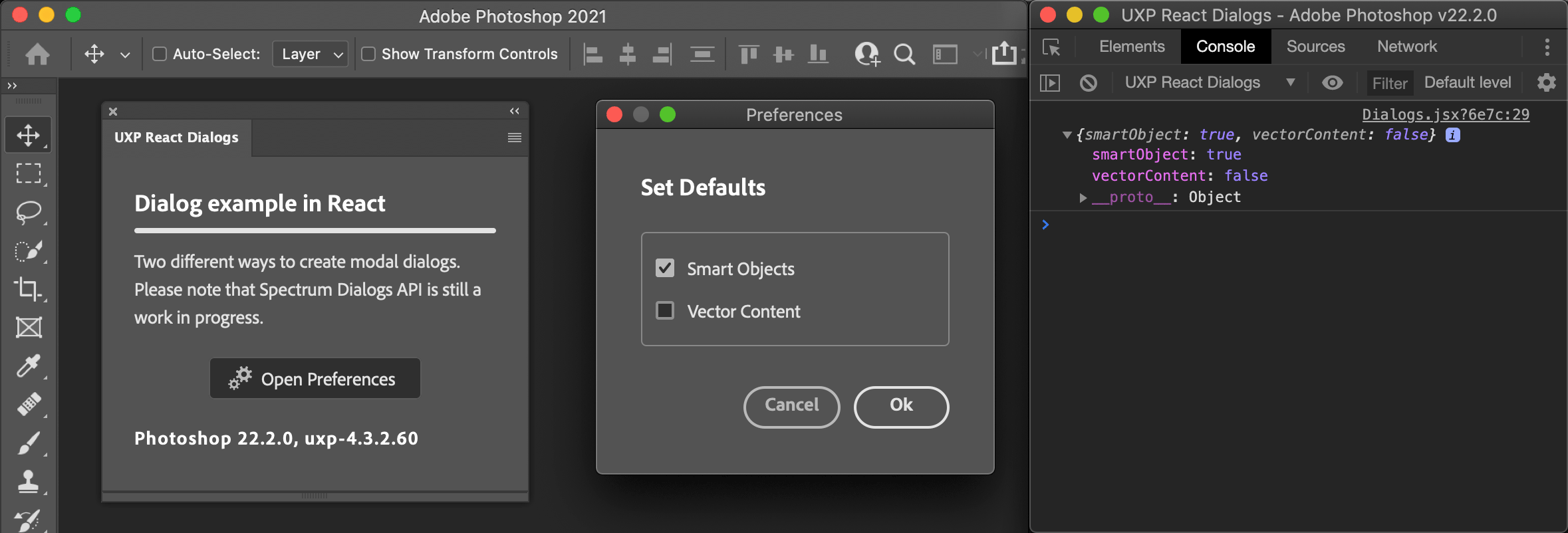
Let’s concentrate on the only two files that matter here, both in the src folder: /panels/Dialogs.jsx, the outer container in the UXP plugin panel; and /components/Preferences.jsx, the content of the dialog that pops up.
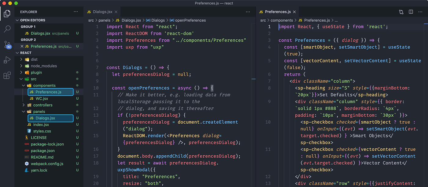
The Dialogs.jsx file is not very fancy but there are two or three things I’d like to point out.
import React from "react";
import ReactDOM from 'react-dom'
import Preferences from "../components/Preferences"
import uxp from "uxp"

const Dialogs = () => {

  let preferencesDialog = null;

  const openPreferences = async () => {
    // Make it better, e.g. loading data from localStorage passing it to the
    // dialog, and saving it thereafter
    if (!preferencesDialog) {
      preferencesDialog = document.createElement("dialog");
      ReactDOM.render(<Preferences dialog={preferencesDialog} />, preferencesDialog);
    }
    document.body.appendChild(preferencesDialog);
    let result = await preferencesDialog.uxpShowModal({
      title: "Preferences",
      resize: "both",
      size: {
        width: 300,
        height: 250
      }
    });
    // Do whatever you need with the {smartObject, vectorContent} result
    console.log(result)
    preferencesDialog.remove();
  }
  return (
    <div>
      <sp-heading>Dialog example in React</sp-heading>
      <sp-divider size="large" style={{ marginBottom: '10px' }}></sp-divider>
      <sp-body>
        Two different ways to create modal dialogs.<br />
        Please note that Spectrum Dialogs API is still a work in progress.
      </sp-body>

      <div className="row" style={{ margin: '20px', justifyContent: 'space-around' }}>
        <sp-action-button onClick={openPreferences} width="160">
          <div slot="icon">
            <svg>
            <!-- Long SVG things going on here -->
            </svg>
          </div>
        Open Preferences</sp-action-button>
      </div>

      <sp-detail size="L">Photoshop {uxp.host.version}, {uxp.versions.uxp}</sp-detail>
    </div>
  );
}

export default Dialogs;
The openPreferences() function is in charge of opening the dialog: interestingly, it uses ReactDOM.render() to render the <Preferences> component, but first it needs to create a <dialog> element (via createElement()) stored in the preferencesDialog variable, and then append it to the <body>. Only then you’re allowed to uxpShowModal(). Also note that when the modal is closed there’s no need to keep the <dialog> around anymore and you can remove() it.
Nothing relevant to mention in the HTML part, just a very simple Spectrum Component structure with a bit of extra styles to keep things properly spaced.
The Preferences.jsx is as follows:
import React, { useState } from 'react';

const Preferences = ({ dialog }) => {
  const [smartObject, setSmartObject] = useState(true);
  const [vectorContent, setVectorContent] = useState(false);
  return (
    <div className="column">
      <sp-heading size="S" style={{marginBottom: '20px'}}>
        Set Defaults
      </sp-heading>
      <div className="column"
      	style={{ border: 'solid 1px #888',
                 borderRadius: '4px',
                 padding: '10px',
                 marginBottom: '30px' }}>
        <sp-checkbox
          checked={smartObject ? true : null}
          onInput={(evt) => setSmartObject(evt.target.checked) } >
          Smart Objects
        </sp-checkbox>
        <sp-checkbox
          checked={vectorContent ? true : null}
          onInput={(evt) => setVectorContent(evt.target.checked) }>
          Vector Content
        </sp-checkbox>
      </div>
      <div className="row" style={{justifyContent: 'flex-end'}}>
        <sp-button variant="secondary"
          onClick={() => dialog.close("reasonCanceled")}>
          Cancel
        </sp-button>
        <sp-button variant="primary" style={{marginLeft: '10px'}}
          onClick={() => dialog.close({smartObject,vectorContent })}>
          Ok
        </sp-button>
      </div>
    </div>
  );
}

export default Preferences;
It’s a stateless function component where I’ve used the state hook to keep track of the two bits of information (the fictitious smartObject and vectorContent) that I want to pass along to the panel on close – see the onClick() handler for the “Ok” button, whereas the “Cancel” returns the same "reasonCanceled".
As I’ve mentioned in the previous video about Spectrum components, you always must use the ternary operator for checkboxes (and set null when needed) otherwise they won’t work properly. Please note that I’m using inline handler functions for the onInput event just for convenience. Also note that, and this is peculiar to React.js, the style must be an object – hence the double curly braces: one set to indicate inline JavaScript, one set for the object notation, with camelCase properties. And finally className in lieu of class: but remember, only in standard elements, not Spectrum components that accept the usual class.
This is just an example; in the real world you may want to, say, always store the values (e.g. in the localStorage) and pass them to the <Preferences> component to populate the modal when it’s shown – but the goal here is to focus on dialog creation.
Recap
Dialogs as we knew them (as ScriptUI Windows, or various simple pop-ups like prompt() and confirm()) are banned in UXP-land. UXP plugins deal with modeless panels natively, and can display modal dialogs as <dialog> elements via uxpShowModal(). <sp-dialogs> (that are slightly different) are coming in the near future so keep an eye at the official documentation. All in all UXP can manage dialogs quite nicely so the transition to the new system shouldn’t be too big of a deal!
Thanks for following along! If you find this content useful, please consider supporting me: you can either purchase my latest UXP Course with ReactJS, or donate what you can like the following fine people did—it’ll be much appreciated! 🙏🏻
Thanks to: John Stevenson ⭐️, Adam Plouff, Dana Frenklach, Dmitry Egorov, Roberto Sabatini, Carlo Diamanti, Wending Dai, Pedro Marques, Anthony Kuyper, Gabriel Correia, Ben Wright, CtrlSoftware, Maiane Araujo, Mihály Dávid Paseczki, Caspar Shelley.
Stay safe, get the vaccine shot if/when you can – bye!
The whole series so far
- #01 – Rundown on the UXP announcement @ the Adobe MAX 2020
- #02 - Documentation
- #03 - UXP Developer Tool
- #04 - Commands vs. Panels and the manifest.json
- #05 - Sync vs. Async code in Photoshop DOM Scripting
- #06 - BatchPlay (part 1): the ActionManager roots
- #07 - BatchPlay (part 2): Alchemist as a UXP Script Listener
- #08 - BatchPlay (part 3): Alchemist as a UXP Inspector
- #09 - Adobe Spectrum UXP
- #10 - Modal Dialogs
- #11 - Flyout Menus and Entrypoints
- #12 - React JS and the UXP plugins Course
- #13 - Manifest v5
- #special - The UXP Landscape Guide