In this episode I’ll talk about UI making and Adobe Spectrum Components. Also a quick and hopefully welcome announcement: from now on I’ll publish a written article alongside with the YouTube video, so that you can choose the medium you prefer.
Native UIs
Let me bring up the slide that I’ve shown in the first episode, that comes directly from Adobe:
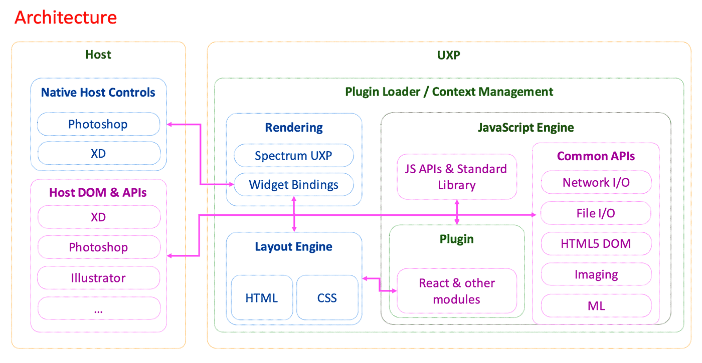
If you focus on the center/left part, you see that the Layout Engine let’s you write – as we already know very well at this point – HTML and CSS, but those aren’t just displayed in some sort of a Browser context, as CEP would do. Instead, UXP maps the DOM representation to a native UI hierarchy at runtime, so the UI is expressed with Native Host Controls (hence it’s faster, as it doesn’t require anything as heavy as CEF – the Chromium Embedded Framework – to step in).
This also means – as it’s been mentioned in this series a lot, but it’s still worth stressing – that you shouldn’t expect UXP to support everything that a Browser would, by default. CSS properties, Browser API or HTML elements must be willingly implemented by the UXP team, and – as it’s fair to assume – priorities must be given.
So for instance we’ve got CSS FlexBox, but not CSS Grids yet – these will come down the line I’m told. Or, as I usually mention because I know that several developers are making use of its 2D context to draw particularly complex and awesome UIs, there’s no <canvas> element yet. So if you feel like there’s something in UXP that is missing and you absolutely need it, feel free send a feature request to the team, I’m sure they’ll note that down – there’s a Forum that you can use.
Although, say, animations are cool, maybe it’s better to have grids first, as they’re more valuable for a larger population of developers, and a robust, non-experimental feature. The good part is that we’re in a very active development phase hence we’re still in the position to chime in and try influence the course of action – the UXP team is listening.
Spectrum UXP
At the moment we’re free to use HTML native “form” elements so to speak, e.g. <select>, or <textarea>, <input> etc. They’re decently styled (not overly cool), you can see them in action in the Kitchen Sink plugin, Native tab:
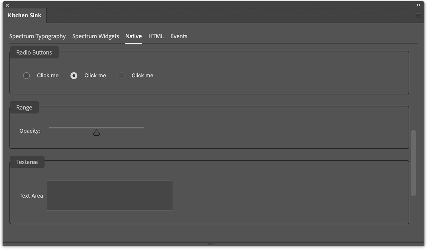
But, be aware that in the long run those HTML native elements will be deprecated in favor of their Spectrum UXP widgets counterparts.
Please note that I’m talking about what I’ve deemed as “form” elements or UI elements only: layout or basic elements such as <div>, <span> and the like will still be available. My suggestion is, when possible, to use Spectrum.
Time to look in more depth to what Adobe Spectrum is, and how implement it in your projects.
Adobe Spectrum
In the beginning there was the Adobe Spectrum Design system: this is the set of specifications that define the Adobe Spectrum Design – the design tokens, color palettes, typography, how to lay out content, etc. all the informed choices that Adobe UI/UX designers made while creating Spectrum.
These are just the specs – you could read them and design, say, a Spectrum-compliant game console or, whatever. In order to implement the Spectrum Design system in the context we care about, then we need something else.
Spectrum CSS
If you google Adobe Spectrum, chances are that the first thing you’re going to run into is the Spectrum CSS, the StyleSheet implementation of the Spectrum Design system. You shouldn’t directly use it though, because this is more about laying down the design of Spectrum elements rather than thoroughly implement their behaviour. Take the stepper for instance:
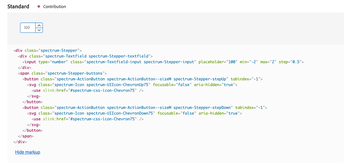
Besides the amount of markup code required it looks OK, but the arrow buttons aren’t wired up, so when you click them nothing happens to the input value. The Spectrum CSS is meant to be used within/to build components that expose a simpler interface, for instance something like a <stepper /> element, which finally brings us to…
Spectrum Web Components
Spectrum Web Components are Web Components that follow the Spectrum specs, obviously enough. Generally speaking, a web component is a reusable custom HTML element that encapsulates a Shadow DOM (a hidden DOM tree that is rendered separately from the Document’s DOM tree) with its own set of styles and behaviour.
There are two different Spectrum web components projects maintained by Adobe: Coral Spectrum, and the Spectrum Web Components.
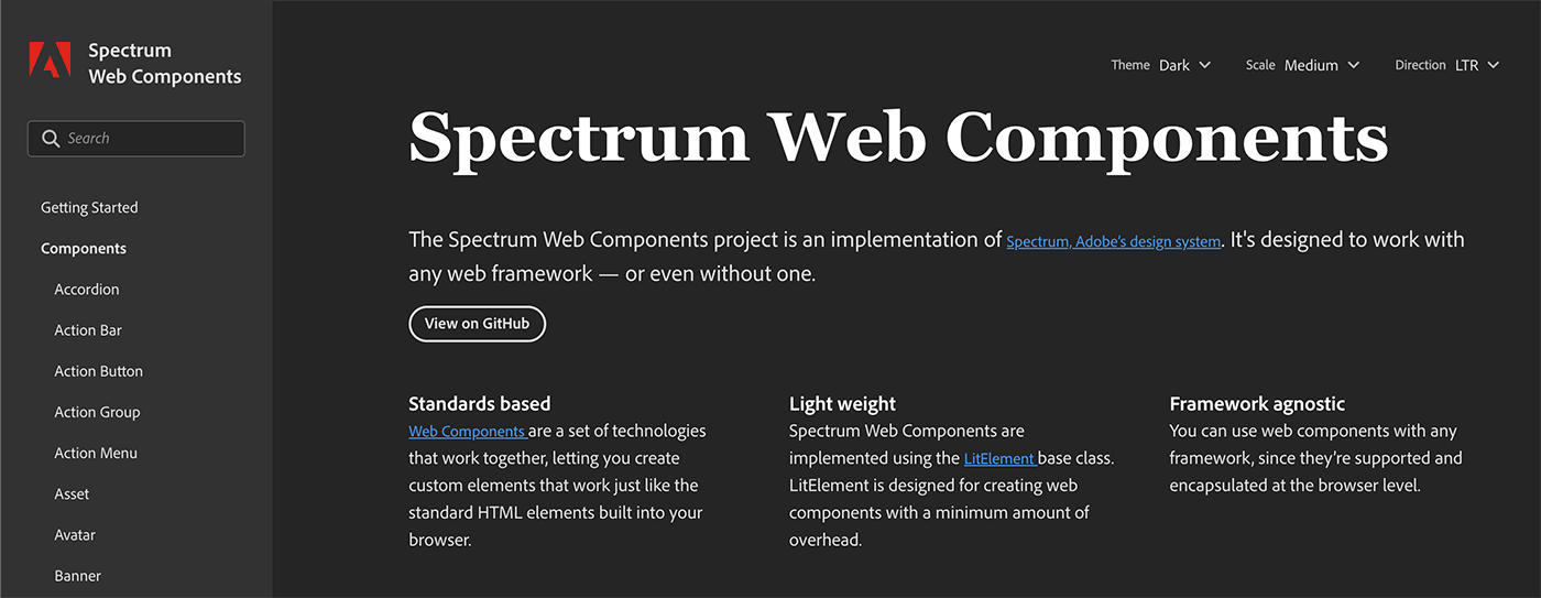
I have no idea why there are two of them, but I like the abundance – I guess that Coral Spectrum pre-dates in a way the Spectrum Web Components, but all in all it’s the Spectrum Web Components the kind of Spectrum web components that are the foundation for the ones in use within UXP that are referred to as “Spectrum UXP” in the documentation.
React Spectrum
Lastly, since Adobe uses React.js as its framework of choice, a different set of React Components have been developed and this is the React Spectrum project.
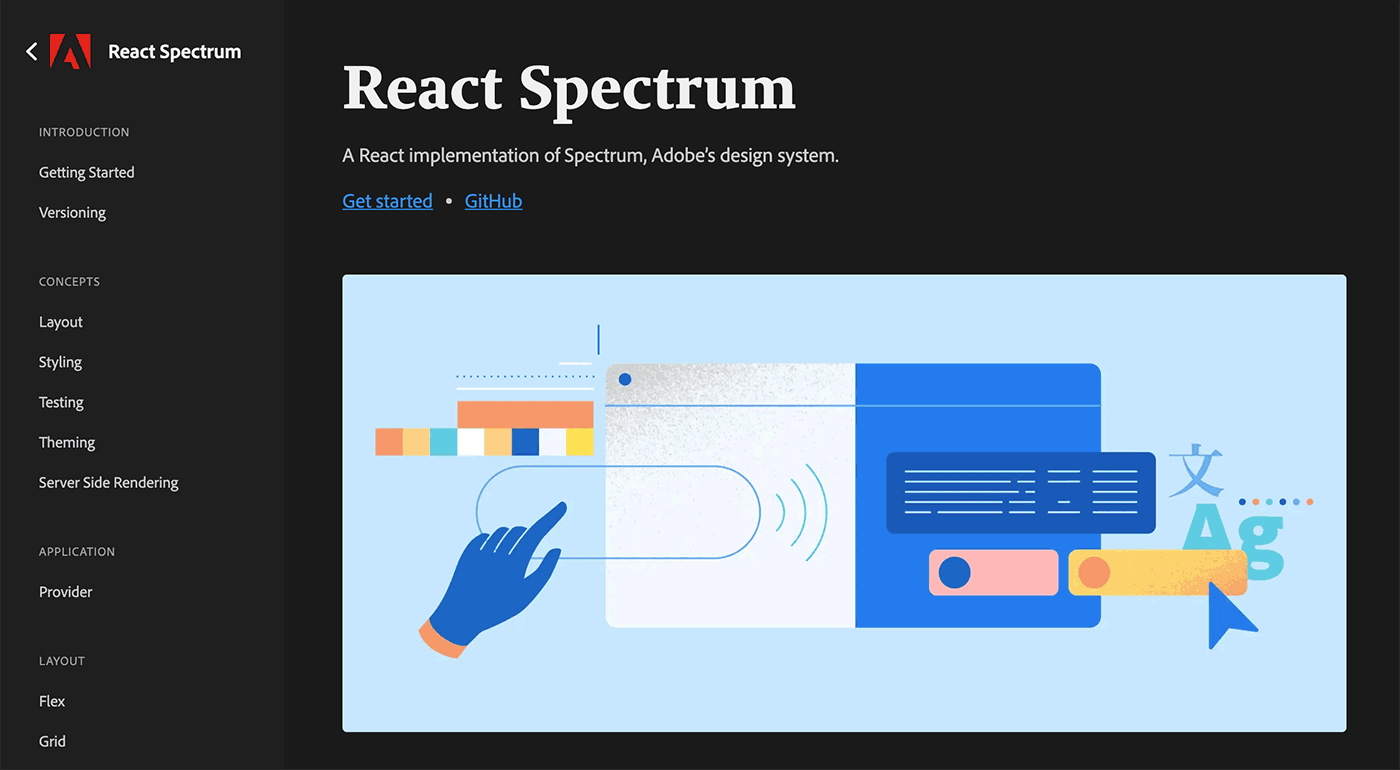
At the moment React Spectrum components are slighly behind in terms of Spectrum coverage but they’re catching up, and in the future – not now – they’re going to be available in UXP projects as well.
Using Spectrum UXP
Speaking of availablility, you don’t need to import or load anything in your projects in order to use Spectrum UXP components: they are available straight away, just use them in your HTML. Please note that at the moment you can use just a subset of components compared to the ones listed in the Spectrum Web Components documentation. As of early February 2021 this is what we have for the Typography:
And for User Interface elements:
- sp-action-button
- sp-button
- sp-checkbox
- sp-divider
- sp-dropdown
- sp-icon
- sp-link
- sp-menu
- sp-menu-item
- sp-progressbar
- sp-radio
- sp-radio-group
- sp-slider
- sp-textfield
- sp-textarea
The team is implementing more Spectrum UXP components so keep an eye on the UXP doc pages. Also please note that:
The Spectrum UXP component API for UXP 4.1 is not perfectly compatible with the published version of the Spectrum Web Components API. Future versions of UXP will have a way to specify the version you need to use, but this is not yet available in UXP 4.1.
Meaning that you’ve got to play cool if the API in the Spectrum Web Components is not entirely funtional in UXP – rough edges will be ironed down as time goes by. Since it’s a bit small and you can easily miss it, the API section of each element is a tab right below the component’s title:
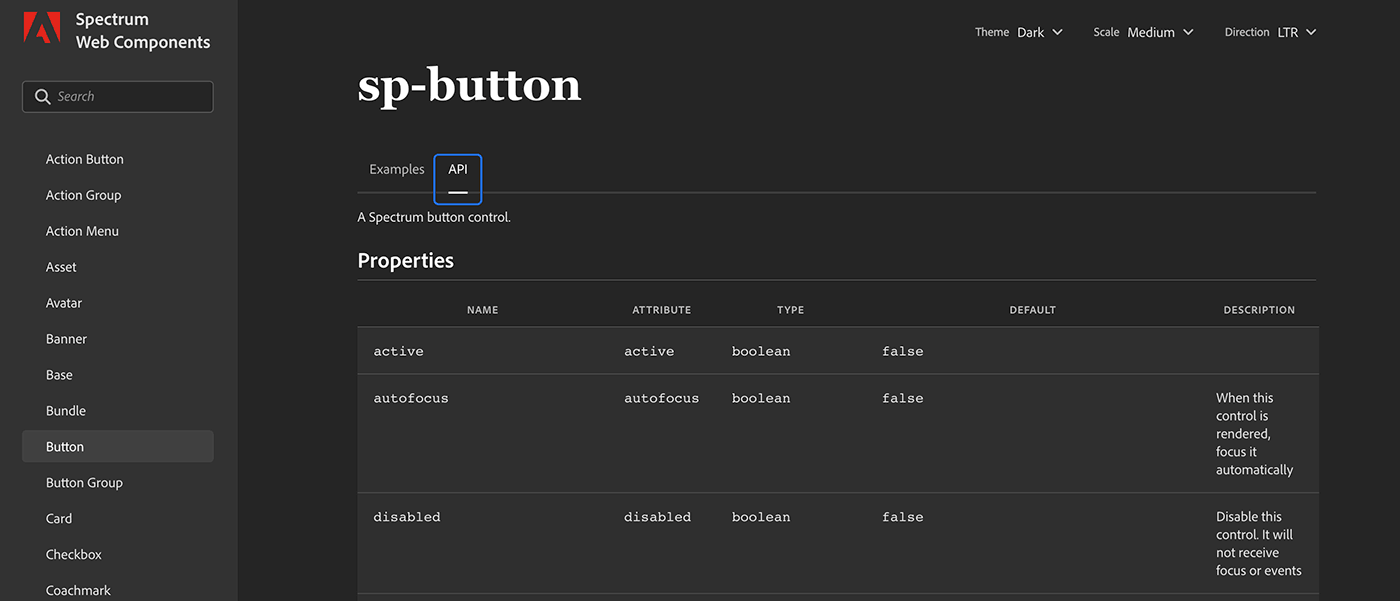
There you’ll find both Properties and Events. Again: be aware that Spectrum UXP isn’t a 1:1 match with the Spectrum Web Components.
Typography
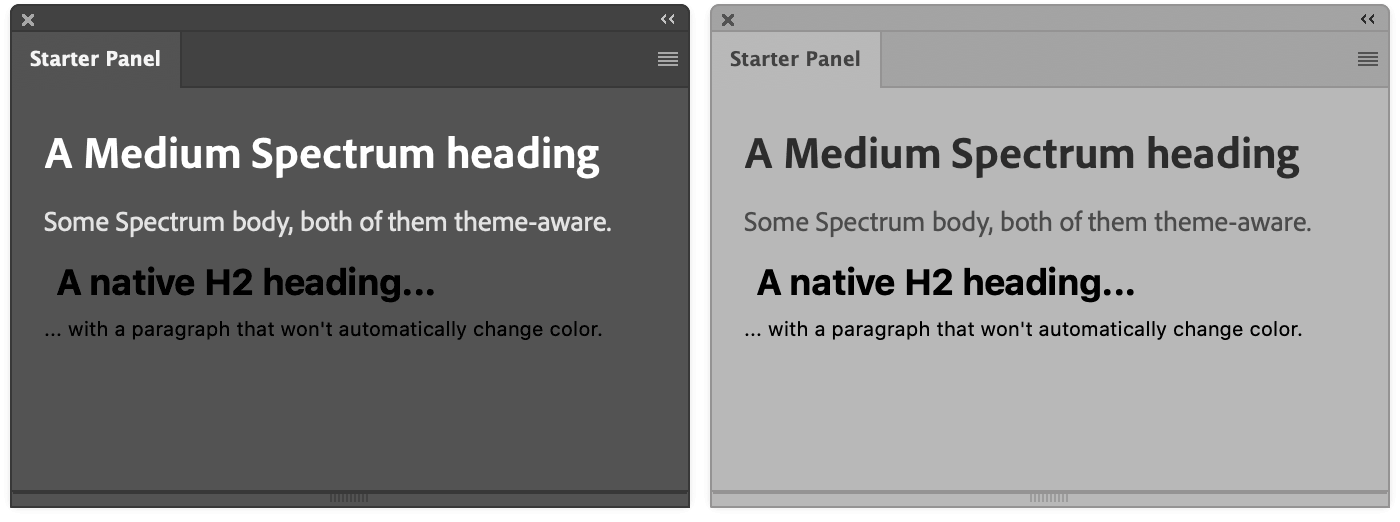
I recommend you to always use of Spectrum Typography elements, e.g. <sp-body> (please note the sp- prefix common to all Spectrum components) in place of the standard <p>. If anything, because they ensure that the text color follows along automatically when the Photoshop theme changes (to either darker, dark, light, lighter), – this is true for <sp-body>, <sp-heading>, <sp-detail> and <sp-label>.
There’s the possibility to use so-called T-Shirt sizes with the size attribute, e.g.:
<sp-heading size="XXXL">Heading XXXL</sp-heading>
<sp-heading size="XXL">Heading XXL</sp-heading>
<sp-heading size="XL">Heading XL</sp-heading>
<sp-heading size="L">Heading L</sp-heading>
<sp-heading size="M">Heading M</sp-heading>
<sp-heading size="S">Heading S</sp-heading>
<sp-heading size="XS">Heading XS</sp-heading>
<sp-heading size="XXS">Heading XXS</sp-heading>
Sizes from XXXL to XS will work for <sp-body> too, in case you need them. Be aware that not all the Spectrum widgets support T-Shirts though, like the <sp-divider>.
<sp-divider size="small"/>
<sp-divider size="medium"/>
<sp-divider size="large"/>
UI elements
Most of the times this is what your plugin will primarily be made of sliders, buttons, checkboxes, text inputs, icons, etc. The supported Spectrum UXP components are documented both in the UXP minisite and more extensively in the Spectrum Web Components doc (that remember, contains a larger set than the one available in UXP).
Please also note that there might be differences between the two sets, for instance if you copy and paste from the Spectrum Web Components the following code…
… It won’t work, because of a slight difference in the way UXP handles icons. The proper code (from the UXP doc) will be something like:
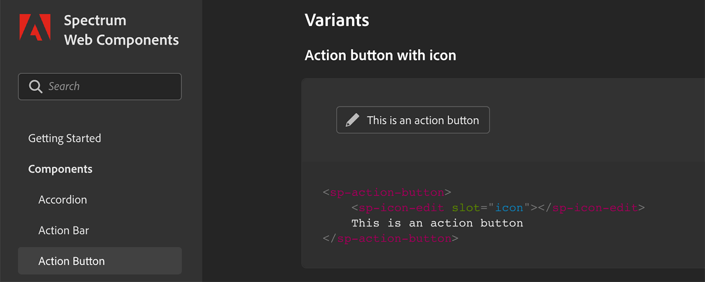
<sp-action-button>
  <sp-icon name="ui:Star" size="xs"></sp-icon>
  Star this project!
</sp-action-button>
Since I’ve mentioned icons let me show you that you can either use the ui set directly as in the example above (only 36 are available, check this page for the list), or you can pick any Spectrum Icon from this 897 strong collection copying the code to the clipboard:
And pasting the <svg> (sanitized of styles and classes) directly into a normal <div> (mind you, not an<sp-icon>):
<sp-action-button>
  <div slot="icon" style="fill: currentColor">
    <svg xmlns="http://www.w3.org/2000/svg" height="18" viewBox="0 0 18 18" width="18">
      <rect id="Canvas" fill="#ff13dc" opacity="0" width="18" height="18" />
      <path d="M12.7675,10.669l-1.604,1.6055,4.3925,4.392a.6815.6815,0,0,0,.96379.00071l.00071-.00071.64-.64a.6815.6815,0,0,0,.00071-.96379L17.1605,15.062Z" />
      <path d="M3.329,9.7655l.726-.726c.2665-.2665-.011-.644-.011-.644l.746-.719A.68149.68149,0,0,0,5.75,7.67l.4055-.4055.781.7805L8.541,6.4405,7.7585,5.66l.264-.2645a.6815.6815,0,0,0,.00071-.96379L8.0225,4.431l-.32-.32s.9425-1.058,1.14-1.256c.8325-.832,2.6755-.2955,2.7605-.7215S7.5115.1275,5.2245,2.414L2.845,4.794a.6815.6815,0,0,0-.00222.96378L2.845,5.76l.161.155L2.3,6.65a.4535.4535,0,0,0-.64081-.02621L1.65,6.6325l-.728.726a.341.341,0,0,0,0,.482l1.9245,1.925a.3405.3405,0,0,0,.48154.001Z" />
      <path d="M5.5205,15.2615c-.787.283-1.7705.6385-2.45.8815l.877-2.45Zm9.1-13.183-11.19,11.19a.56358.56358,0,0,0-.132.2065l-1.062,2.932a.42.42,0,0,0,.55.5545l2.947-1.05a.56353.56353,0,0,0,.21-.1335L17.131,4.578a.4785.4785,0,0,0,.0435-.673l-1.882-1.872A.4785.4785,0,0,0,14.6205,2.0785Z" />
    </svg>
  </div>
  Do the thing
</sp-action-button>
Please note the style="fill: currentColor" in the <div> that keeps the icon’s color in sync with the theme.
This way, if/when needed, you can use also your own custom-designed svg icons in place of Spectrum’s.
Sample code
Let’s put together a very simple example. Please note that code for this plugins can be found at this brand new GitHub repository. I’ve created a new Photoshop plugin using the UXP Developer Tool’s Starter Panel template (see this video if you need a reminder). The HTML is as follows:
<!DOCTYPE html>
<html>
<head>
<script src="index.js"></script>

<style>
body { margin: 0; padding: 0; height: 100vh; }

.column, .row {
  padding: 10px 15px;
  justify-content: space-between;
}

.border {
  margin: 0 15px;
  border-radius: 4px;
  border: 1px solid #888;
}

@media (prefers-color-scheme: dark),
(prefers-color-scheme: darkest) {
  .money {
    fill: rgb(51, 171, 132);
  }
}

@media (prefers-color-scheme: light),
(prefers-color-scheme: lightest) {
  .money {
    fill: rgb(18, 128, 92);
  }
}
</style>
</head>

<body>
<div class="column">
  <sp-heading>Sample Spectrum plugin</sp-heading>
  <sp-divider size="large"></sp-divider>
</div>
<div class="column">
  <sp-body>Just an example of the Spectrum widgets that you're allowed to use in your own plugins...</sp-body>
</div>
<div class="column border">
  <sp-detail slot="label">MAKE SOME CHOICES</sp-detail>

  <sp-slider variant="filled" min="1" max="10" value="3" id="order">
    <sp-label slot="label">How many T-Shirts do you want?</sp-label>
  </sp-slider>

  <sp-radio-group id="size">
    <sp-label slot="label">Pick your size:</sp-label>
    <sp-radio value="XL">XL</sp-radio>
    <sp-radio value="L" checked>L</sp-radio>
    <sp-radio value="M">M</sp-radio>
    <sp-radio value="S">S</sp-radio>
    <sp-radio value="XS">XS</sp-radio>
  </sp-radio-group>

  <sp-dropdown placeholder="Select the color" id="color">
    <sp-menu slot="options">
      <sp-menu-item value="blue">Blue</sp-menu-item>
      <sp-menu-item value="teal">Teal</sp-menu-item>
      <sp-menu-item value="green">Green</sp-menu-item>
      <sp-menu-item value="purple" disabled>Purple (out of stock)</sp-menu-item>
    </sp-menu>
  </sp-dropdown>

  <img src="img/default.jpg" width="200" style="margin: 10px auto; border-radius: 4px" id="shirt-img">

  <sp-textfield placeholder="UXP 🚀" id="message" style="width: 100%">
    <sp-label slot="label">Shirt personalized text (optional)</sp-label>
  </sp-textfield>

</div>

<div class="row">
  <sp-action-button disabled>Give back</sp-action-button>
  <sp-action-button disabled>Complain</sp-action-button>
  <sp-action-button id="buy">
  <div slot="icon" class="money" style="margin-left:8px">
    <svg xmlns="http://www.w3.org/2000/svg" height="18" viewBox="0 0 18 18" width="18">
      <rect id="Canvas" fill="#ff13dc" opacity="0" width="18" height="18" />
      <circle cx="11" cy="7" r="2" />
      <path d="M4,10.5v-7A.5.5,0,0,1,4.5,3h13a.5.5,0,0,1,.5.5v7a.5.5,0,0,1-.5.5H4.5A.5.5,0,0,1,4,10.5ZM17,5.8285A3.008,3.008,0,0,1,15.1715,4H6.8285A3.00753,3.00753,0,0,1,5,5.8285v2.343A3.008,3.008,0,0,1,6.8285,10h8.343A3.00753,3.00753,0,0,1,17,8.1715Z" />
      <path d="M16.5,13H2.5a.5.5,0,0,1-.5-.5v-8A.5.5,0,0,1,2.5,4H3v8H17v.5A.5.5,0,0,1,16.5,13Z" />
      <path d="M14.5,15H.5a.5.5,0,0,1-.5-.5v-8A.5.5,0,0,1,.5,6H1v8H15v.5A.5.5,0,0,1,14.5,15Z" />
    </svg>
  </div>
  Purchase
  </sp-action-button>
</div>
</body>
</html>
And this is the result:
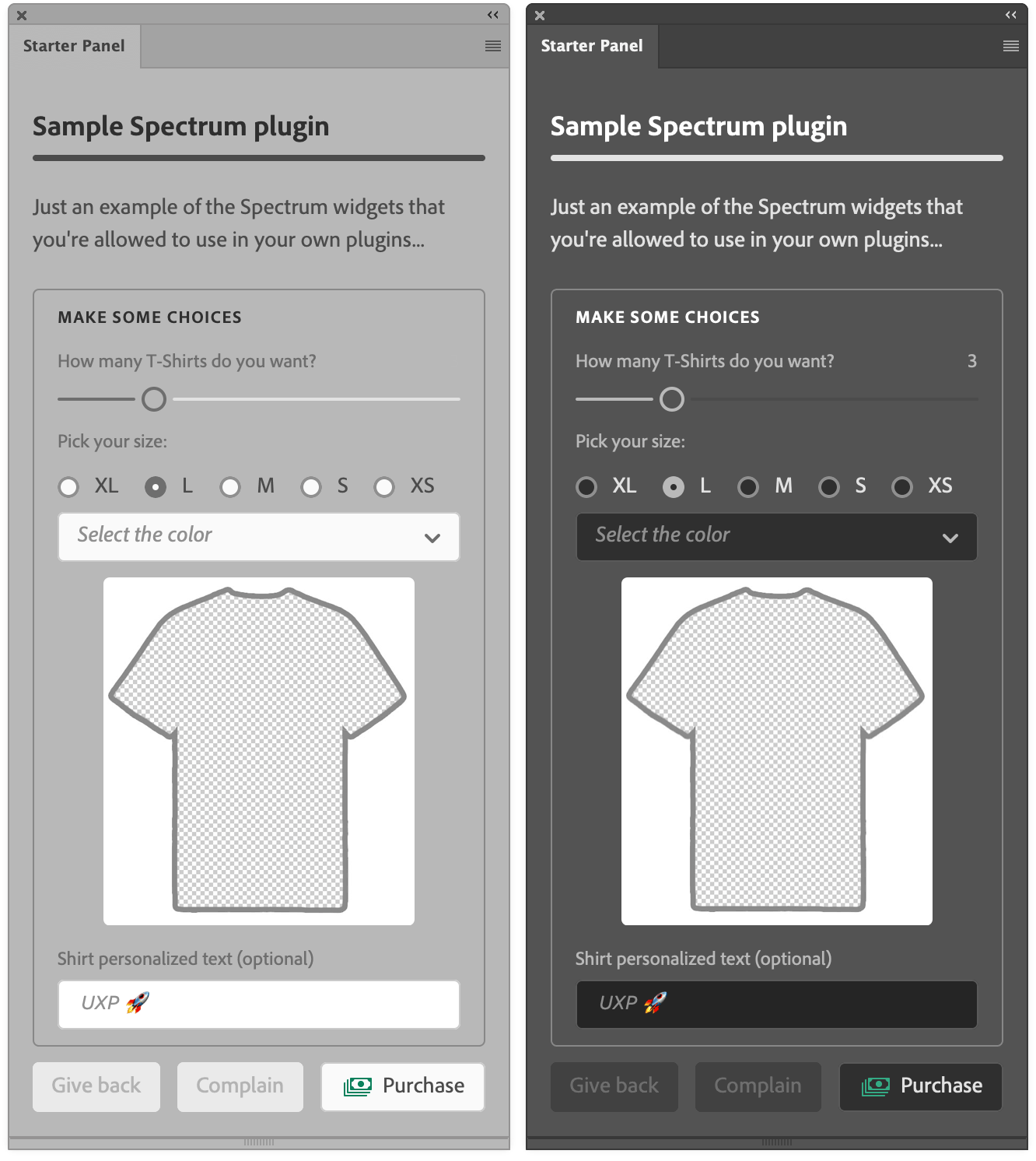
You see that I’m using a <sp-heading> and <sp-divider> as previously demonstrated – <sp-detail> provides some emphasis. Please note that a class named row or column automatically triggers the display: flex and sets the orientation accordingly, which is nice to have.
The <sp-slider> contains an <sp-label>, and is of variant="fill", meaning that the left part of the run is a different color.
A <sp-radio-group> then contains a series of <sp-radio>, one of which is checked.
Then we have a simple <sp-textfield> with a placeholder text (I admit that to me it isn’t dimmed enough to look like a placeholder and it risks to be mistaken for the actual content).
All these elements are wrapped with a <div> that has a border color that happens to be OK no matter whether the theme is dark or light.
Finally, we’ve a row of <sp-action-button> elements: please note that the last one (with a custom icon that comes from the Spectrum set) has a color that varies slightly depending on the theme. You can fine tune such things checking against the prefers-color-scheme in the media queries, as demonstrated in the <style> section.
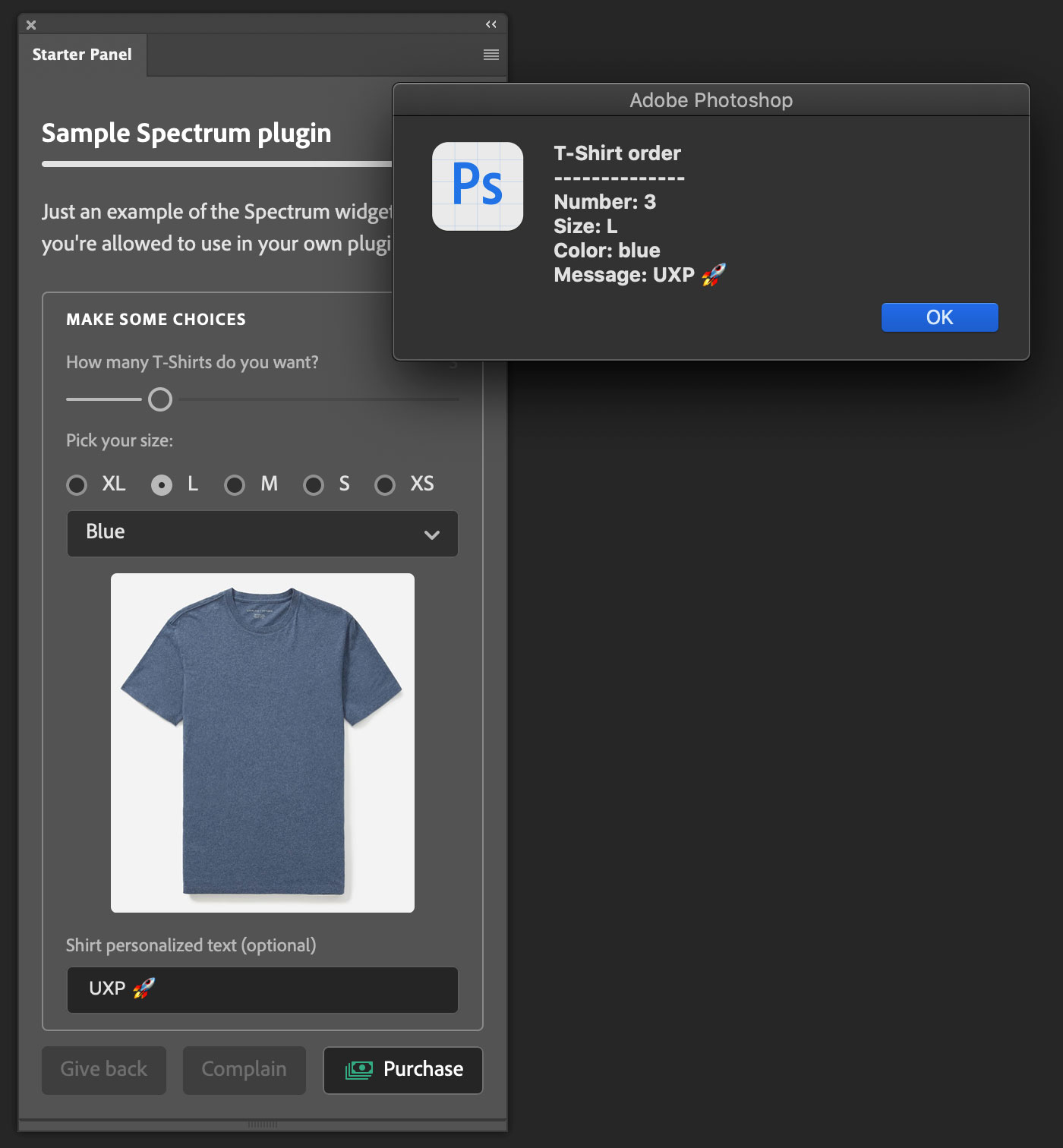
The JavaScript part is super simple, and it’s all about collecting the UI values in an alert popup.
const app = window.require("photoshop").app;

// T-Shirt Color dropdown
document.querySelector("#color").addEventListener("change", evt => {
  document.querySelector("#shirt-img").src = `/wp-content/uploads/2021/02/${evt.target.value}-shirt.jpg`
})

// Buy button
document.querySelector("#buy").addEventListener("click", evt => {
  let color = document.querySelector("#color").value;
  if (!color) {
    app.showAlert("Please pick a T-Shirt color");
    return;
  }
  let order = document.querySelector("#order").value;
  let message = document.querySelector("#message").value;
  var selectedSize = [...document.querySelectorAll('#size sp-radio')]
                     .filter(radio => radio.checked)[0].value;
  app.showAlert("T-Shirt order" +
  "\n--------------" +
  "\nNumber: " + order +
  "\nSize: " + selectedSize +
  "\nColor: " + color +
  "\nMessage: " + (message === "" ? "none" : message))
})
There’s a listener for the T-Shirt Color <sp-dropdown>’s change events, that switches the img source using the value that comes in from the event to interpolate the filename string, appending the -shirt.jpg suffix.
The Purchase button click handler initially checks whether the T-Shirt color has been chosen (otherwise it alerts the user and returns), then it goes on storing all the rest of the UI data.
Please note that it’s not possible to use just:
document.querySelectorAll('#size sp-radio:checked')
It only works with native <input> elements. Hence the need to filter() the collection, select the first element in the resulting array and finally getting the value. In the end, app.showAlert() is fired.
Caveats
I haven’t been able to use any Spectrum CSS Property, the kind of which you can find e.g. in the core-global.css. That would have been useful e.g. for color tokens. Alas the following doesn’t work:
.icon {
  fill: var(--spectrum-global-color-static-orange-400);
}
Besides, such named colors automatically vary on dark/light themes, slightly but noticeably to accomodate for the simultaneous contrast effect due to the background color change – something I’ve tried to take into account tweaking the money icon’s green manually.
Please note that Spectrum UXP interfaces tend to be larger than CEP, especially if you were used to space-savvy CSS such as Topcoat – expect around an extra 20%+ area. I’ve asked whether there are plans for an even smaller version of Spectrum, specifically targeting Creative Cloud applications; I’ve got no answers yet, but that would be useful IMHO.
Finally, if you use Spectrum UXP with React.js there are a few things that you should keep in mind:
- Always check against
undefinedornullfor boolean attributes:
<sp-checkbox checked={preview ? true : null}>Preview</sp-checkbox>
- Use
classinstead ofclassName:
<sp-textfield class="absolute"></sp-textfield>
- Always close tags:
<sp-slider min={1} max={150} step={1}></sp-slider>
More details in this page.
Wrap up
I think this wraps it up for this introduction to Spectrum UXP: you’ve seen where it comes from and how to use it – again, if you feel like there are any glitches, feel free to submit feature requests to the team. Spectrum is an important piece in the grand scheme of Adobe’s things so I’m confident that they’ll be addressed.
Thanks for following along! If you find this content useful, please consider supporting me: you can either purchase my latest UXP Course with ReactJS, or donate what you can like the following fine people did—it’ll be much appreciated! 🙏🏻
Thanks to: John Stevenson ⭐️, Adam Plouff, Dana Frenklach, Dmitry Egorov, Roberto Sabatini, Carlo Diamanti, Wending Dai, Pedro Marques, Anthony Kuyper, Gabriel Correia, Ben Wright, CtrlSoftware, Maiane Araujo, Mihály Dávid Paseczki, Caspar Shelley.
Stay safe, get the vaccine shot if/when you can – bye!
The whole series so far
- #01 – Rundown on the UXP announcement @ the Adobe MAX 2020
- #02 - Documentation
- #03 - UXP Developer Tool
- #04 - Commands vs. Panels and the manifest.json
- #05 - Sync vs. Async code in Photoshop DOM Scripting
- #06 - BatchPlay (part 1): the ActionManager roots
- #07 - BatchPlay (part 2): Alchemist as a UXP Script Listener
- #08 - BatchPlay (part 3): Alchemist as a UXP Inspector
- #09 - Adobe Spectrum UXP
- #10 - Modal Dialogs
- #11 - Flyout Menus and Entrypoints
- #12 - React JS and the UXP plugins Course
- #13 - Manifest v5
- #special - The UXP Landscape Guide