 Contemporary Art Photography means, among the rest, that the work of your client the Artist will end up printed, framed and exhibited in galleries and museums, luckily all over the world. Current trend is to print BIG, like Candida Höfer: not uncommon to see impressively sized 100 3/4 x 81 inch artworks (there must be something evil in even digits: 100 x 80 inch for sure sounds too cheap).
Anyway, as a Post-Producer in this particular business, my job has always been targeted to BIG prints: that is, an awful amount of attention to details – for the devil lives there, and we’re always full of friends that like to pay him a visit.
In the last few years I’ve seen the trend of BIG artworks stabilize – which is a true pain for everyone involved in the making of: starting from the Artist (who needs to carry around utterly expensive gear in airports), to the mounter (larger D-bond / aluminium / foam boards more difficult to manage), the framer (thicker, heavier plexiglass), the courier (bigger fatter safe-boxes to transport to the other side of the ocean).
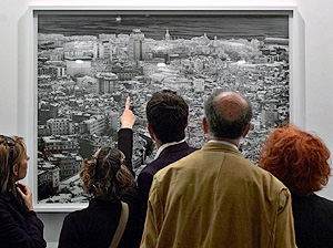 When stars align properly and each one’s job is done right – i.e. the mounter doesn’t screw up the print while mounting it (which happens more often than it should) – our fellow artists and friends gather and start looking at the work of art at a distance (quoting the latest Bruce Fraser) largely determined by their nose’s length at the exhibition opening. I’m told that curators, gallerists and critics usually don’t pay attention to some aspect we’re highly concerned about, for their interest lies elsewhere; while colleagues’ favorite sport is to meticulously inspect the image, then the print, the frame, the lights, (and the buffet) in order to express apparently well informed criticisms. Such as:
-
“Too much digital” (digital what, we’re not allowed to know)
-
“Photoshop!” (which of course is outrageous)
-
“Too much unsharp mask”
-
“Too much grain”
-
“The white border isn’t wide/white enough”
-
“The paper texture is too much textured”
-
“The sponsor is too much prominent”
Etc. etc.
My own impression is that sometimes they stick to details because they miss the BIG picture (that is: the concept behind the image), but I’ve heard so many funny commentaries that I tend not to pay attention to them anymore.
Nonetheless, other’s opinions in this small world still matter to the Artist in the business who lives on it, so (back in topic) as a Post-Producer I trained myself to play in defence.
I admit this approach finds a good ground in my personal attitudes (I’ve never been an attack player even in chess) – but dealing with Contemporary Art Photography I’ve learned that you must always frame each post-production step in the perspective of a BIG print, even when preparing a file for a 8×10 reproduction on a catalog (hopefully, sooner or later you’ll end up with a BIG print of it). Each contrast enhancement leads to some extent to noise problems (whether luminosity grain or chromatic noise), perspective distortion may exaggerate lens’ corners focus fallout, sensor’s bayer grid in high resolution digital backs can paint weird moirée patterns, etc.; which aren’t a big deal by themselves if you print small (say, under 44 inches long side, 110 cm) or for a book. But become intolerable on a 64 x 82 inches (160 x 210 cm) inkjet print which will be exhibited abroad and inspected by a herd of friends.
As a necessity, I’ve been forced to develop an insane attention to small details and alas, there’s no ready made solution to the above mentioned problems except manual work. In order to survive your client’s degree of fanatism will soon become yours, and you’ll find yourself painting out on a Color layer green and magenta halos on specular highlights (depending on their position compared to the focus point, behind or ahead), or painfully remove dust, scratches (limestone deposits, development stains, fingerprints fat) that disturb the uniformity of the grain on a large format scan.
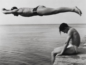
Nino Migliori - The Diver, 1951
Weird activity that, depending on your attitude, may be embraced as a zen practice – or a wild punishment, kind of a rite of passage: when I started Fineartprint.it (my very first own company with the friend and photographer Roberto Legnani) we did a huge lot of scans and postproduction work for italian neorealism-years photographers (such as Nino Migliori and Piergiorgio Branzi) and I remember vividly entire weeks spent retouching vintage images fullscreen – I was like visiting the moon’s landscape; images whose B/W negatives did pass through too many hands over the years.
It happens that my job involves also digital fine art printing (aka large format inkjet), so I’ve had the dubious pleasure to deal with Epson and Hahnemuhle tech support. Strangely enough, it happens frequently that so much effort is spent on image capturing (i.e. flying to the other side of the world in remote locations with expensive gears), and frequently not a comparable, fair amount of attention is paid to the object production process – which is kind of bizarre. I’ve seen with my very own eyes big prints with evident dark banding (paper feed issue), light banding (clogged nozzles and/or head misalignment) or mounted images with evident paper flaws (that even in the most expensive rag based papers happens regularly).
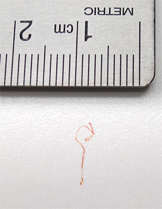 Knowing how much they charge for mounting, framing and shipping, to see such a casual approach to printing still puzzles me. To the best of my skills (which in this case don’t go too far) I also do actual retouching – I mean, with brush and paint, to mitigate paper problems such as small rag paper base issues or impurity that may lay down between the paper base and the coating. Speaking of which, I keep a record of cases that includes, besides the usual black dots, even (bright) red curly hairs – how on earth do they happen to get stuck between the paper and the last coating layer I don’t know.
To summarize, what in some commercial work may be seen as an utterly insane maniacal attention to detail, it becomes for the Contemporary Art Photography Post-Producer (and printer) a good habit.
The fascinating process of artwork production (from the concept to the framed print) is a sum of many, different steps that must be kept at their top level for the artwork to be called this way: and as the one in charge for such important technical aspects of the entire job you should be aware of this idea.
Or, if you prefer to see it in reverse: if you don’t always do your best, agreeing to small imperfections, they will eventually sum up… not the brightest idea, not the right camera, not the fastest lens (ok, at least on these first three ones they can’t put the blame on you!), few chromatic aberrations left, the perspective not exactly corrected, a so-and-so retouching, the print with some micro-banding, the paper with a couple of bumps, the mounting with a bulge, the plexi with some dust. Does the contemporary world really needs more of that, aren’t we filled up enough?
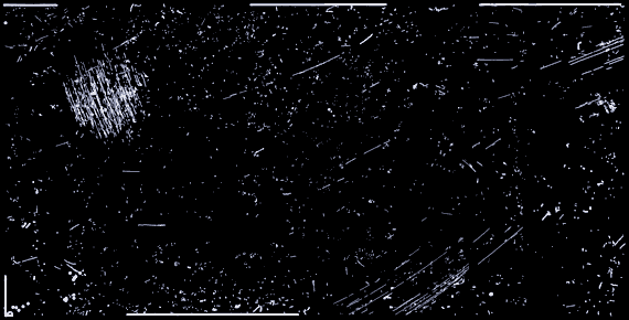
[The opening picture is the retouch map (i.e. a description of retouching strokes) of a 6×12 negative, acquired with an Imacon-Hasselblad scanner, resulting in a 1×2 meters @200 ppi file, about 16.000px long side]