In a previous post I’ve introduced the recently open-sourced Spectrum CSS. Here, I’ll be demonstrating how to use them to build a simple Vue.js component: a DropDown menu.
Spectrum CSS are really appealing, but as I’ve mentioned earlier, they’re not bundled with any JavaScript – besides what you may borrow from the online documentation page. While elements such as Sliders are plug & play, for they actually do use a <input type="range"> wrapped in a lot of finely styled <div> tags, others such as the DropDown are not.
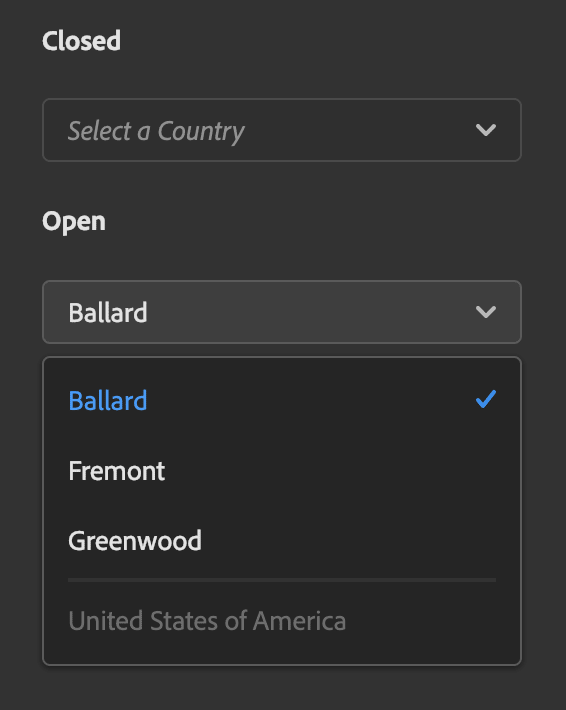
I.e. if you click on a Closed dropdown, it won’t open (the above is just a screenshot so it’s pointless to try, but the result would be the same). The reason being that a Spectrum DropDown is not really a <select> element, as you can see in the snippet below:
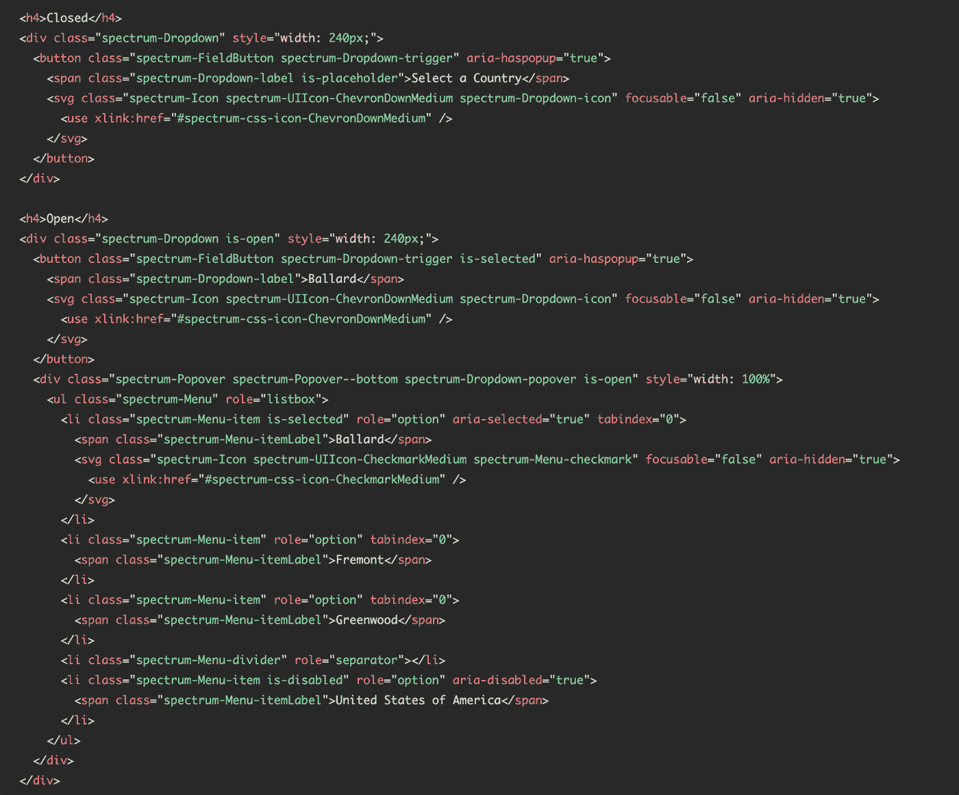
As far as I get, re-creating an element from scratch is a standard practice to avoid rendering differences between browsers (the <select> is a good example here).
Anyways: no <select> means no default behavior on click, change, etc. In other words, you are the one in charge of populating the <div> elements above and adding relevant event handlers so that the DropDown stops being a nice but still and useless object.
This is a perfect test case for encapsulating everything in a Vue.js Component! The only drawback is that I don’t feel particularly comfortable with the idea of creating Components from scratch. All my CEP Panels use Vue.js now, that’s true, but frankly in a very simple and not over-engineered fashion: I’ve always used one shared data, the farther I’ve ventured into fanciness was setting up an Event Hub.
Thanks god I’ve a PhD in Copy&Paste, so I’ve been able to adapt this one:
… into a proper Vue Component that wraps the Spectrum DropDown original markup. The .vue file I came up with is as follows:
I won’t go too much into the details here. If you look at the <template> tag and compare it with the original Spectrum html, you can spot the differences: I’ve added a couple of classes that depend on the selected item or the showMenuboolean, and used a v-for loop to populate the options.
The <script> tag is where the actual logic belongs: I’ve added two methods, one to show the opened dropdown and one to emit an event to the parent when something is selected. From the props you’re able to tell how to consume such element, e.g.:
<drop-down :options="arrayOfObjects" v-on:updateOption="methodToRunOnSelect" placeholder="Select a thing..."/>The result is this one:
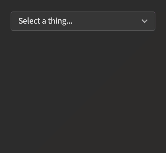
It is quite bare, I may want to add transitions and such… but it works!
To tell you the truth, I thought I couldn’t be able to make it: I had a look at proper Vue.js UI Kits (like this one) and they exceed, by far, my understanding. Luckily I’ve been able to borrow code and adapt it, so I may be doing it again in the future for other elements that I would need.
If you’re up for the same thing, or you know how to make my code better, please let me know in the comments. Bye!